- 4 days ago
- 10 min read

Homepage design examples are like the front door to your website. It's the first thing visitors see, setting the tone for their experience. A strong homepage does more than just look good. It's about encouraging visitors to take action, like signing up, subscribing or making a purchase. When making a website, your homepage should combine clear messaging, easy navigation and an engaging website design.
To help you create a homepage that works for your goals, we've gathered 15 of the best homepage designs. These examples highlight creativity and functionality, offering inspiration for building a site that stands out.
Need ideas for your next website? With Wix's website builder, you can build a professional website that looks exactly how you imagined. Choose from thousands of customizable templates and use Wix’s drag-and-drop website builder to make it your own. Creating a unique, professional website has never been easier.


Get inspired by website design ideas.
TL;DR: best homepage design examples
Your homepage often makes the first impression—so it should tell your story clearly, look polished and guide visitors toward what matters most. In this guide, we break down 15 homepages that strike the right balance between form and function, with takeaways you can apply to your own site.
You'll also get practical tips on layout, hierarchy and messaging, so you can build a homepage that not only looks good but actually works harder for your brand.
How we chose these homepage design examples
What we looked for | Why it stood out |
Strong first impression | Clear messaging and visuals that pull visitors in immediately |
Easy-to-follow structure | Clean layout and intuitive navigation |
Compelling calls to action | Clear next steps that guide users through the site |
Brand personality | Visual and written tone that reflects the business identity |
Responsive design | Performs well across screen sizes and devices |
"Each combination of design elements has the potential to evoke specific emotions, convey subtle messages and leave a lasting impression on viewers. From the choice of font to the selection of colors and the incorporation of graphic elements, every detail plays a crucial role in shaping the overall identity of a brand." - Yaya Aaronsohn, head of Brand Maker at Wix
15 best homepage design examples
A great homepage sets the tone for your entire site. It helps visitors find what they need and tells your brand’s story in a clear and engaging way. Explore these website examples for inspiration and if you’re ready to start building, check out our tips on how to go about making a website. Here are 15 homepage design examples that nail both form and function, offering inspiration for your next project.
01. Slack

Slack’s homepage is a perfect example of how to combine functionality with a clean modern design. The layout is intuitive, making it easy for visitors to understand Slack’s value proposition at a glance. The use of bold headlines like “Bring your people, projects, apps and AI agents together” immediately communicates the platform’s purpose.
High-quality visuals and animations create a dynamic and engaging experience
Clear CTAs like “Get started” and “Find your plan” guide users effectively
Social proof with logos of top companies builds trust and credibility
Integration details highlight how Slack works with over 2,600 apps
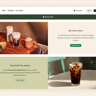
02. Starbucks

Starbucks’ homepage is a masterclass in seasonal branding. The current focus on fall flavors with vibrant images of pumpkin and pecan drinks creates an inviting and warm atmosphere. The design is simple yet effective with clear navigation and engaging CTAs.
Seasonal themes keep the content fresh and relevant
High-quality product images make the offerings irresistible
Rewards program details encourage user engagement
Easy access to ordering options enhances user convenience
03. Uber

Uber’s homepage is all about simplicity and functionality. The design focuses on helping users quickly find what they need, from booking a ride to exploring other services like Uber Eats. The use of large bold text and minimalistic visuals ensures clarity.
Straightforward navigation makes it easy to book rides or explore services
Prominent CTAs like “See prices” and “Get started” drive action
Trust-building elements like safety features and customer support are highlighted
Clean responsive design ensures a seamless experience across devices
04. Lyft

Lyft’s homepage is an excellent example of how to combine robust functionality with a truly user-friendly design. It presents information clearly, is visually engaging and is expertly crafted to guide visitors smoothly toward taking desired actions. Plus, a QR code for app download is conveniently displayed at the bottom of the page.
Clear messaging with headlines like “The world awaits” sets the tone
High-quality visuals of riders and drivers create a relatable vibe
Action-oriented CTAs like “Sign up to ride” and “Apply to drive” are prominently placed
Trust-building elements like “Safety never takes a backseat” highlight Lyft’s commitment to community and safety
05. Lemonade

Lemonade’s corporate website homepage is a great example of how to make insurance approachable and easy to understand. The design is clean and modern with a focus on simplicity and transparency. The use of bright colors and playful illustrations makes the corporate website experience enjoyable.
Clear and concise messaging explains the value of Lemonade’s services
Interactive elements like quick quotes engage users
Testimonials and reviews build trust and credibility
Minimalistic design ensures a distraction-free experience
06. Airbnb

Airbnb’s homepage is a visual treat that inspires wanderlust. The design focuses on showcasing beautiful destinations and unique stays, encouraging users to explore. The search bar is prominently placed, making it easy to start planning a trip.
Stunning visuals of destinations and properties create an emotional connection
User-friendly search functionality simplifies trip planning
Highlighted features like “Experiences” and “Online Experiences” add value
Trust-building elements like reviews and ratings reassure users
07. Dropbox

Dropbox’s homepage is a lesson in clarity and focus, thanks to its minimalist website design. The design emphasizes the platform’s core value—secure file storage and sharing. The use of simple visuals and concise text ensures the message is clear.
Clear headline and subheadline explain the platform’s purpose
Minimalistic design keeps the focus on the core message
Prominent CTAs like “Try Dropbox free” encourage action
Trust-building elements like security features and customer logos are highlighted
08. Four Seasons

Four Seasons’ homepage, a prime example of a luxury hotel website, exudes luxury and sophistication. The design uses high-quality visuals and elegant typography to create a premium feel. The navigation is intuitive, making it easy for users to explore destinations and book stays.
Stunning visuals of properties and destinations set the tone
Clear CTAs like “Check rates” guide users effectively
Responsive design ensures a seamless experience across devices
Prominent "Download the App" button for mobile access
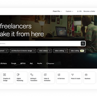
09. Fiverr

Fiverr’s homepage is a great example of how to showcase a wide range of services effectively. The design is clean and organized with a focus on helping users find what they need quickly. The use of categories and search functionality enhances usability.
Clear and concise messaging explains the platform’s purpose
User-friendly navigation and search functionality simplify the experience
Testimonials and success stories build trust
Highlighted features like “Popular Services” guide users to explore
10. NYC Ballet

NYC Ballet’s homepage is a stunning blend of art and functionality. The design uses high-quality visuals of performances to captivate visitors. The navigation is simple, making it easy to explore upcoming shows and purchase tickets.
Beautiful imagery of performances creates an emotional connection
An interactive calendar feature allows users to easily view the performance schedule
A prominent subscription feature in the footer keeps users informed about upcoming shows and news, showcasing how thoughtful website footer design can boost engagement.
Responsive design ensures a seamless experience across devices
11. Evian

Evian’s homepage is a refreshing example of how to use branding effectively. The design is clean and modern with a fixed menu that ensures easy navigation and a strong focus on the brand’s commitment to sustainability. The site features high-quality visuals, engaging content, and a cohesive layout that keeps visitors interested while reflecting the brand's identity.
Clear messaging highlights the brand’s values and mission
High-quality visuals create a premium feel
Interactive elements like product showcases engage users
A dropdown menu in the navigation allows users to switch to their country’s homepage
12. La La Land

Lionsgate’s homepage for the award-winning film “La La Land” is a cinematic experience in itself, perfectly capturing the movie's magical and romantic essence. From the moment the page loads, full-screen visuals and engaging video content to immediately draw visitors into the world of Mia and Sebastian. The color palette mirrors the film's vibrant, dreamlike aesthetic. The navigation is kept simple and intuitive, making it easy for users to explore trailers, view photo galleries and find where to watch the movie.
Stunning visuals create a cinematic feel
Clear CTAs like “Watch Trailer” guide users effectively
Trust-building elements like awards and reviews are featured
Fixed background creates a seamless scrolling experience
13. Revlon

Revlon’s homepage is a great example of blending beauty with functionality. The design features stunning visuals and engaging content that effectively showcase their products. The navigation is straightforward with a drop down menu, making it simple for users to explore various categories and find what they need quickly. This balance of aesthetics and usability creates a seamless experience for visitors.
Beautiful imagery of products creates an emotional connection
Clear CTAs like “Shop Now” guide users effectively
Integrated eCommerce features simplify online shopping
Organised navigation menu allows users to find categories with ease
14. Ladurée

Ladurée’s homepage design is a visual treat that captures the essence of French luxury. The design uses high-quality visuals of macarons and other products to create an inviting atmosphere. The navigation is simple, making it easy to explore the menu and place orders.
The logo is displayed in the top middle, creating a sense of balance and focus
Stunning visuals of products create an emotional connection
Featured products section highlights iconic products
Elegant font adds a touch of sophistication
15. Outdoorsy

Outdoorsy’s homepage is a great example of how to inspire adventure and wanderlust. The design uses stunning images of RVs and beautiful destinations to create an inviting atmosphere that speaks to the user's adventurous spirit. The navigation is simple and intuitive, making it easy for visitors to explore rental options, plan trips and book their next getaway using the site's online booking system.
Beautiful imagery of destinations creates an emotional connection
A prominent search bar allows users to quickly find RVs by location and date
“Featured destinations” section inspires users with travel ideas
Clear calls-to-action like “RV Rentals” and "Escapes" guide users
For further inspiration, check out these eCommerce website examples and Wix websites.
Best practices for homepage design

Creating a great homepage is all about clear communication and smart design choices. By following a few trusted methods, you can build a page that not only looks professional but also helps you connect with your visitors. Think of these best practices as your guide to making a strong first impression as you design your homepage.
Keep it simple and focused
Your homepage should have a clear purpose. Instead of crowding it with too much information, focus on one main goal. This could be getting visitors to subscribe to your newsletter, explore your products or book your services. A clean and simple layout helps guide visitors to that desired action without causing confusion.
Write a clear and compelling headline
You have just a few seconds to grab a visitor's attention. Your headline should quickly explain what your business offers. Make it short, direct and focused on the value you provide. Remember, typography matters here—choosing the right fonts and sizes helps your message land with impact. A strong headline paired with a brief subheadline can immediately tell visitors they are in the right place.
Use strong visuals
High-quality images and videos can speak volumes about your brand. Great media features should be relevant to what you do and help tell your story. Good homepage design examples often use compelling visuals to create a mood and draw visitors in. Make sure your images are optimized for web so they load quickly and don’t slow down your site.
Make navigation intuitive
Visitors should be able to find what they're looking for easily. A logical and straightforward navigation menu is essential. Group related pages together and use simple labels like "About," "Services" and "Contact." Your main navigation should be at the top of the page where people expect to find it. Consider exploring website templates that have intuitive navigation built in, making this step even easier.
Include a strong call to action (CTA)
Your homepage needs a clear call to action. This is usually a button that prompts visitors to take the next step. Use action-oriented text like "Start Your Trial" or "Learn More." Make your CTA button stand out with a contrasting color so it catches the eye. The best homepage design examples place their main CTA in a prominent spot above the fold.
Build trust with social proof
People trust what other people say. Adding testimonials, customer logos or reviews to your homepage can build credibility. This social proof reassures new visitors that you are a trusted business. It shows them that others have had a positive experience with you.
Learn more: What is web design?
How to design your homepage with Wix
Wix enables easy website design with intuitive drag-and-drop tools, giving you complete creative control over your homepage layout, typography and visuals without any coding skills. Wix provides industry-specific website templates for better branding, with hundreds of homepage designs ready to customize.
For AI-assisted design, Wix Harmony takes you from a single prompt to a fully designed, business-ready homepage for any industry or creative vision. Aria, Wix Harmony's built-in AI agent, stays contextually aware of your canvas throughout, generating page sections, refining copy and advising on design decisions at every step. Move fluidly between AI-generated design and precise drag-and-drop editing whenever you want, all backed by Wix's enterprise-grade infrastructure.
Wix also offers a native app in ChatGPT that generates a fully designed, production-ready Wix Harmony homepage instantly. Tag "@Wix" in a conversation, describe your design vision and your site is ready to launch.
Homepage design examples FAQ
What are the main components of a good homepage?
A strong homepage usually includes a few important parts working together. Think of it as a friendly welcome that tells visitors what you're all about. The main components are:
A clear headline and subheadline: Quickly explain what you do.
A primary call to action (CTA): Tell visitors what to do next like "Shop Now" or "Book a Session".
Compelling visuals: Use high-quality images or videos that match your brand.
Simple navigation: Make it easy for people to find other pages on your site.
Social proof: Feature testimonials or logos of companies you've worked with to build trust.
A footer: Include contact information and links to important pages.
How do I design a homepage?
Designing a homepage is all about planning. Start by defining your main goal. Do you want visitors to buy something, subscribe to a newsletter or contact you? Once you know your goal, build the design around it. Choose colors, fonts and images that reflect your brand. Keep the layout clean and uncluttered so visitors aren't overwhelmed. Many website builders offer templates you can customize to get great homepage design examples without starting from scratch.
What is the most important part of a homepage?
The most important part of a homepage is a clear value proposition. This is a simple statement that tells visitors what you offer and why it matters to them. It should be one of the first things they see. When someone lands on your page they should immediately understand who you are, what you do and how you can help them. This clarity is what turns a visitor into a customer.
What is the purpose of a homepage?
The main purpose of a homepage is to make a great first impression and guide visitors to the next step. It's the main entry point to your website so it needs to capture attention and communicate your brand's core message instantly. A good homepage convinces visitors to explore the rest of your site and take a desired action.


