- Amanda Weiner
- Apr 7
- 16 min read
As Aristotle famously taught us, the whole is greater than the sum of its parts. But of course, that doesn't mean we can ignore the importance of those parts. This is especially true when it comes to websites. Great websites are composed of multiple amazing parts that seamlessly fit together to create a holistic representation of your brand.
In order to help you understand the various parts of a website, we’re going to break them down and elaborate on their purpose. This article will cover the main components of sites as well as some important web design jargon to help you get through the design process. If you’re looking to cut to the chase and figure out how to make a website with a tool that will ensure that all website parts are accounted for, we suggest using the Wix website builder.
11 basic parts of a website
There are some components of websites that are so essential to web design that all sites must contain them in order to function properly (all included in website templates). Together these parts form the backbone of your website:
01. Header
The header is the first thing visitors see—it’s like the front door to your website. A good header sets the tone for your site and quickly tells people who you are and what you do.
Most headers include your logo, menu and sometimes a call-to-action like “Book now” or “Get started.” You can also add extras like a search icon, language switcher, phone number or shopping cart if you run an online store. Here’s how headers change depending on the site type:
Online store: Add a cart icon, search bar and clearly labeled product categories for easy shopping.
Service business: Highlight your contact info or add a “Get a quote” or phone button to encourage inquiries.
Portfolio or personal brand: Keep it clean and simple with a strong “About” or “Hire me” link.
Nonprofit: A bold “Donate” button in the header can help drive support.
Make your header mobile-friendly
Mobile users want speed and simplicity. A cluttered header on a small screen will confuse visitors and make them leave before the page even loads.
Here’s how to keep your mobile header clean and effective:
Use a hamburger menu (☰): It keeps your full menu tucked away neatly. Just make sure it’s easy to tap and opens smoothly.
Keep your logo small but clear: It should still be readable and clickable.
Focus on one call-to-action: “Call now,” “Book,” or a cart icon—don’t overdo it.
Make space count: Remove anything unnecessary. Social icons, extra links or search bars should go in the menu, not the header.
Pro tip: Link your logo back to your homepage—it’s one of the most common user habits. Also, keep your header sticky (fixed to the top) so it’s always easy to access as visitors scroll.

02. Menu
Think of your website menu like a GPS—it helps visitors get around and find what they need. A clean, organized menu makes your site feel simple and easy to use. Here’s a breakdown of some common menu styles:
Horizontal Menu: A classic layout with menu items in a row, usually at the top of the page. Perfect for sites with fewer categories.
Vertical Menu: Found in sidebars, this type works well for sites with lots of sections or categories.
Dropdown Menu: Great for organizing lots of content into subcategories. Hover or click to reveal more options.
Mega Menu: A larger menu often used by eCommerce sites or big companies. It displays lots of options at once and can include images or icons.
Hamburger Menu (☰): Popular for mobile or minimalist designs. It keeps headers clean and reveals more links when clicked.
Setting up your website menu: Core pages and tailored navigation
Start by choosing your core pages—Home, About, Services or Products, Contact, and maybe a Blog if you have one. These are the must-have links visitors should find right away. Once you’ve got the essentials, design your menu to match your brand. Keep it simple and focus on guiding visitors to what matters most.
Ecommerce site: Make shopping simple by organizing products into categories like “Men,” “Women,” “Accessories” or “New Arrivals” and “Sale.” Help customers find what they need fast, hassle-free.
Restaurant: Include pages like “Menu,” “Order Online,” “Reservations” and “Specials.” A “Chef’s Corner” with recipes or cooking tips can add a personal touch to your site.
Freelancer or creative: Share your work with pages like “Portfolio,” “Testimonials” and “Work with Me.” Add personal touches like “Behind the Scenes” or “My Process” to connect with potential clients.
Local business: Make it easy for customers to find you with sections like “Locations,” “Book an Appointment” or “Hours & Directions.” Offering seasonal services? A “Current Promotions” tab can help.
Online course or educational site: Include pages like “Courses,” “Instructor Profiles,” “Enroll Now” and “Student Testimonials.” A “Resources” or “Blog” section with extra learning materials or tips can add even more value.
Real estate website: Make browsing simple with pages like “Properties for Sale,” “Rentals,” “Featured Listings” and “Open Houses.” Add extras like a “Mortgage Calculator” or “Request a Showing” page to make things easier.
Event or conference site: Include pages like “Schedule,” “Speakers,” “Sponsors,” and “Tickets.” Got multiple dates or locations? Add sections like “Location 1” or “2025 Schedule” to keep things organized.
Photography portfolio: Organize your work into categories like “Weddings,” “Portraits,” “Events” or “Travel.” If you’re offering services, include a “Book a Session” page to make it easy for clients to get in touch. An “About” page is a great way to share your story and connect with visitors.
Technology or SaaS company: Focus on pages like “Features,” “Pricing,” “Resources” and “Support.” Include “Case Studies” or “Customer Success Stories” to build trust and credibility with potential customers.
Blog or news site: Keep things organized with sections like “Latest Posts,” “Trending” and “Archives.” Cover multiple topics? Use categories like “Health,” “Technology” or “Lifestyle” so readers can easily find what they need. Don’t forget to include an easy-to-use “Search” bar.
Health & fitness site: Add pages like “Services,” “Classes,” “Nutrition Plans” and “Success Stories.” If you sell products, include an “Online Store.” A “Blog” with health tips or motivational content is a great way to keep your audience engaged.
Navigation tips: Keep your menu clean and simple with 5 to 7 items so visitors don’t get overwhelmed. Use clear labels like “Contact” instead of playful ones like “Say hello”—clarity goes a long way. For sites with lots of pages, a dropdown or mega menu can help keep things organized and easy to navigate. Check your links regularly because broken ones frustrate users and damage trust. Always test your menu on both desktop and mobile to make sure everything works smoothly.

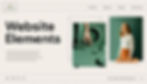
03. Above-the-fold visuals
Immediately below the header is some form of image, series of images or sometimes a video. Together, the header and main image comprise the top section of your website - often referred to as above the fold - and are essential in creating a good first impression. The featured visual, in particular, makes a marked difference in whether users stay on your website or abandon seconds after entering. With that in mind, this visual should convey something important about your company. Whether it features images of your products or services, or just gives the user a feel of what your brand is about, it is important that it relates to your site as a whole. We suggest choosing your best images or browsing the images and videos available through Wix to give your website a professional edge.
Popular first impression visuals
Hero image: A large high-quality photo that reflects your brand and business. Think a cozy café interior for a coffee shop or a happy customer using your product. Avoid generic stock images as they can feel impersonal and reduce trust.
Hero video: A short silent video in the background that adds movement or atmosphere. For example, ocean waves for a surf school or behind-the-scenes clips for a handmade brand. Keep it under 10 seconds and optimized to avoid slowing down your site.
Slideshow/carousel: Rotating images that highlight offerings like seasonal products, services or special deals. A fashion site might display new arrivals or collections. Stick to 3–5 slides to keep it clear and focused.
Product photo: A clean standout image of your top product or offer. This helps visitors quickly see what to explore or buy first. Pair it with a strong call-to-action like “Shop now” or “Get started” and keep the background simple so the product pops.
Lifestyle image: A relatable photo of someone using your product or enjoying your service. This helps build an emotional connection. A fitness brand could show someone mid-workout or a pet brand might feature a dog enjoying a treat.
Full-screen background: A bold image or video that takes up the entire top section of the site. Use minimal text like a headline and call-to-action to keep the focus sharp. This style works well for creative brands like design studios or photographers.
Animation: Subtle movements like text fades, hover effects or scroll-triggered elements. These draw attention to important sections and create a dynamic modern feel. Use them to highlight CTAs, show progress or guide visitors through your page naturally.
03. Website content
All sites contain content. Content typically means the words written on your site that explain what your website is about, what you have to offer and how site visitors can take advantage of your offerings. Website content covers a wide array of things. It often refers to the paragraphs that explain your site’s mission, but it can also mean the one word that is placed on your buttons.
While short content on buttons or menus may seem insignificant, it is actually the driving force of sites. This is the content that makes it clear what site visitors should expect when they click, such as “Buy now” or “Shopping cart”. Take the time to carefully plan out your website content and pagination, meaning the division of web content into pages, to ensure that any site visitor can understand your brand as well as you do.
04. Footer
Simply put, a footer is the bottom most part of any site. It usually contains a sitemap with hyperlinks to the pages available on your site. This can help visitors find all of your offerings, including those that may not have made the cut for your header.
Often website footers also contain basic contact information, enabling users to reach out to you or find your physical storefront. This type of information is crucial for business success.
Footers also might include a social bar that contains small but recognizable icons that lead users to your social media pages. This can help you gain followers on social media platforms, ultimately bringing about greater brand awareness and potential business growth.

Advanced elements of a website
If you were to just include the website parts mentioned above, you’d already have a complete site. However, if you want to take your site to the next level, we suggest adding the following parts as well.
06. Logo
An essential element of any brand, a logo is also a standard part of a website. A logo represents the company and makes it recognizable and memorable to both current and potential customers. Typically logos can be found in the top left hand corner of the website header and are usually clickable to help visitors return to the site’s homepage. To get started on your logo, and easily embed it on your site, you can use a logo maker that automatically generates a custom logo for you.

07. CTA
A CTA, or call-to-action, is a short piece of text that helps customers take the next step with your business and move down your sales funnel. CTAs are typically displayed on buttons and contain actionable words like “Start now” or “Buy yours”. This type of text directs users to take a specific action and tells them exactly what to expect when they click on a button.
CTAs are important parts of websites because they enable visitors to actually use or buy your service or product. Without these buttons, you could see fewer sales and a higher rate of customers leaving your site without converting.

08. Sidebar
Often websites will use a sidebar, or a horizontal bar typically on the right side of screens that contain more links or information. A sidebar is meant to act as another navigation facet of your site, enabling visitors to find information that is important, but less critical than the information in your header.
Typically, sidebars contain links to other content on your site, a way to sign up to your newsletter, and advertisements. Utilizing this space for ads is a good way to monetize your website and help you grow your business. Alternatively, you can advertise your own products in this space, making them easily visible to site visitors even before they see your product page.
09. Blog
Blogs are essentially groupings of articles or posts on a variety of topics that are all related to your business. These days, it’s increasingly common for businesses to add a blog to their site. While blogs can stand on their own, they also can be added as an additional part of an existing website, functioning as a marketing asset for your company.
Adding a blog to your website is a good way to accomplish a couple of goals. First, it provides more in-depth information to your customers about your offerings or industry. By providing this information, you are nurturing your customers and helping them understand your business better.
A blog can also help bring more traffic to your website. By covering a variety of topics in depth, blogs can provide the answers to many questions that people search for on Google. When you answer these questions, you help attract people who may not have found your business otherwise.
According to Tom Menashe, international growth managers lead at Wix,
"AI is steering technology into the future, and search engines are riding this wave of transformation. With AI advancements, search engines are fundamentally reshaping how digital information is organized and delivered to users. Google's unveiling of its upcoming Search Generative Experience (SGE), is expected to prioritize content based on expertise and firsthand experience. This signifies a notable shift in user-centric search strategies: Gone are the days of repetitive content clones. To climb the ranks, authentic firsthand perspectives are now key".
Learn how to make a blog with Wix, with a blog maker.
Subscribe to the Wix blog for a weekly dose of fresh web design tips and trends.

10. Forms
Online forms are generally used to gather information. On websites, they can be embedded and used for a number of different purposes. For example, you might consider including a contact form, which enables visitors to contact you directly from your site. Another type of form, such as a signup form, can help you gather leads by asking visitors for their information.
Depending on the type of form that you choose to use, you might consider placing them in different areas of your site. Generally speaking, a form might be a bit too aggressive for the homepage, but it can take a spot on a separate web page or perhaps lower down on your site.

11. Homepage
A homepage is where visitors land and get to know your brand. Technically, it’s the root URL of your website (e.g. yourwebsite.com) and works as the main entry point for users. Since it’s usually the default link in search results, the homepage acts as the hub that connects to other pages on your site, making it the “home” for everything your site offers.
Your homepage is where visitors learn who you are and what you offer. It sets the tone for your site, so design and content should work together smoothly. Use visuals like a hero image or a quick intro to spotlight your brand. Keep the layout simple and easy to navigate so people can quickly find info about your products, services or mission.
The homepage helps guide visitors to important sections of your site. Add links to pages like “About,” “Services” and “Contact,” and feature your best content upfront. This could be a recent blog post, a customer review or a popular product. For shops, highlight top products or categories like “New Arrivals,” “Sale Items” or “Best Sellers” to grab attention right away.
Layout of website parts
Now that you’ve determined which parts of a website you’ll need, you might be wondering how to organize them. There are many different website layouts, each of which has its own benefits and keeps your website orderly.
The most classic website layout contains a homepage and multiple web pages that enable you to find the information you’re looking for. Another option, however, is a one-page website design. This type of website places all the information on one long, scrolling page. The advantage of this layout option is that everything that a visitor might be looking for can be found in one place. When utilizing this website layout, make clear distinctions between the sections, and help visitors navigate to these sections by including anchor links in the header.
Learn how to choose a website template that best suits your needs, or read a designer's tips for selecting the right layout.
Additional website components
There are a few items that are not a part of the web design itself but are essential in ensuring that your site is up and running. While this list is in no way exhaustive, familiarizing yourself with these concepts is a good way to start your website creation journey.
01. Web hosting
Web hosting is simply where your website lives online. Although it doesn’t seem like it, all websites take up space on servers, or computers that act as storage units and provide information to other computers. These servers ensure that your website is alive and well and available when people search for it.
With Wix, free web hosting is built in so whenever you create and publish your website, it will automatically be hosted. That means you won’t have to worry about finding an external host or paying for a third-party service.
02. Domain names
You may have heard the word domain thrown around in the website world. A domain is simply the web address of your site. It is often the same as the company name and gives your website a unique access point online. If your brand is called Rosa, for example, your domain might be something like rosa.org or rosa.com.
We highly recommend getting a unique domain name so that people can easily find and remember your site. For example, when you want to search for something or get more information, the first site that comes to mind is google.com. This type of domain recall and knowledge can help bring more success to websites.
03. SEO
SEO, or search engine optimization, is the process of making your site findable on search engines. It involves optimizing the content, images, design and structure of your site to ensure that search engines are understanding your website well. This, in turn, enables Google to serve your website in response to relevant search queries.
SEO is a complex world that encompasses many things. If you are new to the world of SEO, we suggest utilizing Wix SEO which helps you get indexed on Google. It also provides some actionable suggestions for how you can tweak your site to help it rank higher.
Why is knowing the different parts of a website important?
Knowing the different parts of a website is important for several reasons:
Understanding website structure and website navigation: By understanding the different parts of a website, you can better grasp how your website is structured and how users navigate through it. This knowledge can help you identify key areas of a website, such as the homepage, navigation menu and content sections and understand how they contribute to the overall user experience.
Evaluating website design and functionality: Knowing the different parts of a website enables you to evaluate the design and functionality of your website. You can assess the effectiveness of the header, hero section, content layout, sidebar and footer in achieving the website's goals and providing a positive user experience.
Identifying and resolving usability issues: Understanding the different parts of a website can help you identify usability issues that may hinder user navigation and engagement. You can spot problems like poor navigation structure, cluttered layouts or ineffective CTAs that prevent users from finding what they need or taking the desired actions.
Creating effective website content: Knowing the different parts of a website can guide you in creating content that is tailored to each section's purpose and audience. You can craft clear and concise headlines for the hero section, informative and engaging body copy for the content section, and compelling CTAs for the footer.
Communicating effectively with website designers and developers: Understanding the different parts of a website allows you to communicate more effectively with website designers and developers. You can clearly articulate your design goals, content requirements, and user experience expectations, ensuring that the website aligns with your vision and objectives.
Parts of a website FAQ
What is the main part of a website called?
The main part of a website is called the homepage. The homepage is the first page that users typically see when they visit a website, and it serves as the central hub or entry point for exploring the website's content.